Building in EdApp: Fitness Microlearning
Goal:
Build a simple, engaging course that tests popular features of this mobile and microlearning management system. DesignxHumanity has a special agreement with this small tech firm to publish content, and before my design team starts building on the platform, I wanted to get more familiar with it.
Lesson 1
Lesson 2
Solution:
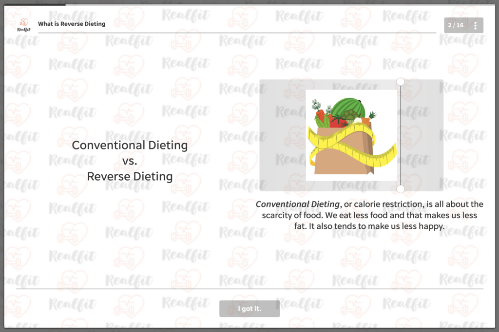
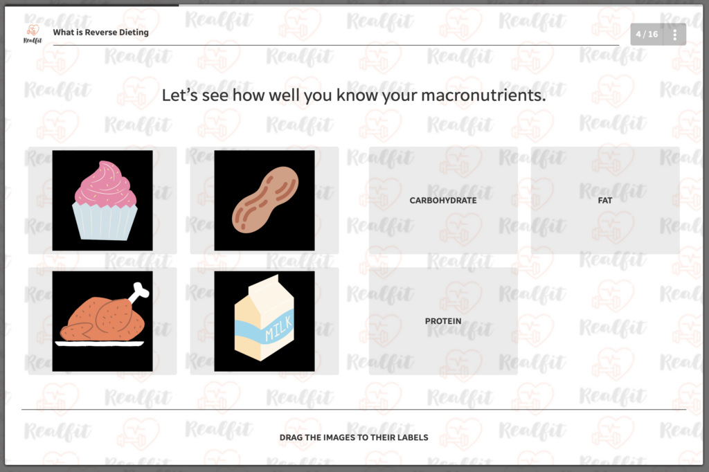
Once again, I became my own SME, skipped the planning phase and went straight for the edapp admin panel to begin development. I used Tailor Brands to quickly design a cute logo for a faux fitness brand, which is displayed throughout the course. All graphics were imported from Canva, which is integrated, or screenshots. I used a bit of markdown language and CSS, mostly to change the size of fonts.


Outcome:
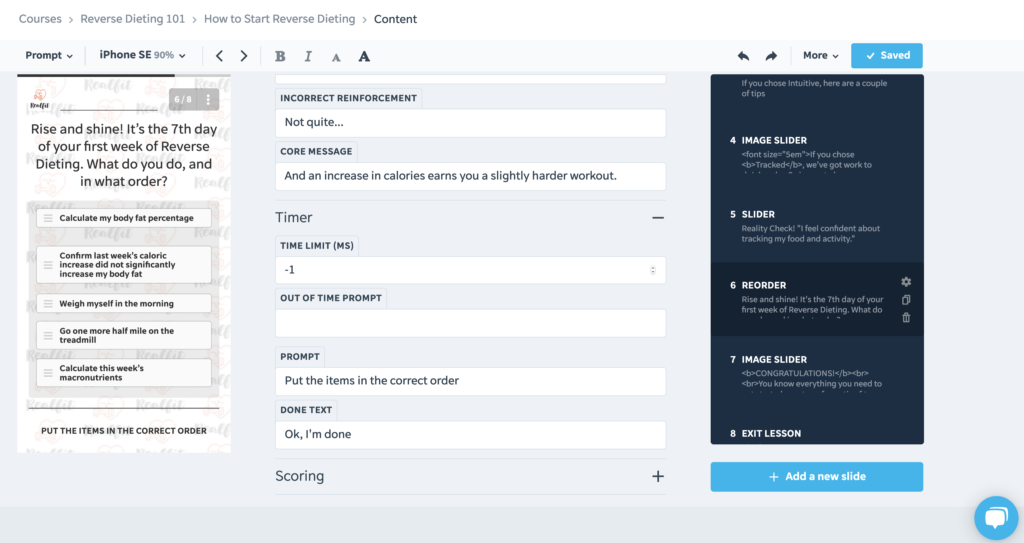
Without weighing it against any objective standards, and considering I threw this up in about two days, not bad! The pedantic side of me wishes I could add more slides to the second lesson to balance it out, and I still might. In Lesson 1, I used mostly content slides, where text might be revealed via a slider, in an accordion menu or revealed through vertical scrolling. My favorite part is where I have a simulated dialog between the user and the app, where she explains more in depth what Reverse Dieting is. I included a short video and then some “Further Reading.” For the second lesson, I discussed how to begin the process. To be honest, it’s not nearly as exciting as Lesson 1, but I do ask users to think. For example, I have them plan their day by putting activities in order. Overall, though, I don’t think the content is overwhelming. But when planning for responsive platforms, I’ll need to be more careful about content placement and colors.

Lessons Learned:
- I learned that I love being able to preview changes in real time. That feels like a game-changing feature to me. Huge props to the EdApp team for this. Imagine how quickly a course can be built, and also the ease of replicating the storyboard!
- EdApp’s admin panel is deceptively simple — practically plug n play. So make sure to cross every T and dot every I or you’ll frustrate yourself. For example, one of the lessons wasn’t displaying the course’s branded background. Why? The course and each lesson can have specific branding! I needed to check the lesson’s branding box for “Use course branding.” Took me forever to figure this out.
- EdApp has its own markdown language, but also uses HTML and CSS. I haven’t yet figured out which is more expedient, but I do continue to struggle with aligning lists to the left when the default is centered. Let me know when you figure it out!
- If I upgraded my plan, I could include discussion forums and assignments. It is also possible to schedule a live session.
- However, as some of my colleagues at DxH have discovered, EdApp does have its instructional limitations such as…
- The native tools do not include branching scenarios. Users can click on links that lead out of the app, or you can embed Storyline or Captivate SCORM packages.
- Users can’t re-do some a (most?) knowledge check after being told it’s wrong. There is space for summative feedback, though.
- No captured native user input except for the survey and forums. You can capture analytics, but not learner content.
- Some design limitations include…
- Not being able to have an avatar for a right-side speech bubble.
- Not being able to change the navigation style for some slide types.
EdApp may be the most accessible mobile LMS out there. The next thing I want to explore on it is the user analytics. How much information is captured and how can that help me build better courses? Either way, I recommend IDs check it out!
