Building in Rise 360: CNA Training
Articulate’s Rise 360 is a quick authoring tool that has just enough interactivity to be useful while keeping customization at a minimum. It’s very much Storyline Extra-Lite, with an emphasis on text-based learning, plug-n-play interactions, and smooth transitions and interfaces.

What I might like to add to this in the future:
- Narration
- Another video, but with accompanying step-by-step instructions
- More explanation and clinical language in the beginning
- A few more knowledge checks
- More navigational instruction for Rise newbies

The content has an emphasis on skills and procedure. The knowledge component is primarily of the ranges of normal readings the CNA would take from a resident, which is easy enough to establish, but I wanted to also include some explanations for why a reading might be abnormal. This also helped fill out the original content as well, since it was actually very sparse. I added more clinical language and terms, particularly near the end of the course, so that the learner felt more of a sense of increased difficulty and importance in their tasks.
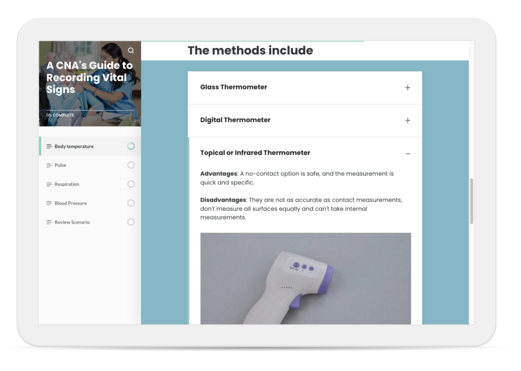
What I do like about Rise 360 is how easy it is to standardize. It’s as easy as duplicating a lesson and then tweaking a few things inside here and there. The variety of interactions — mainly some sort of click and reveal — is limited, so it’s a good idea to space out the types through the course. For example, if you used an accordion in the last lesson, don’t use it in the next one. It’s important to keep the interactions as fresh as possible.

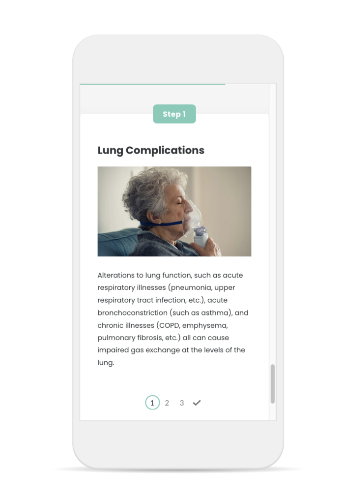
What do you think about images in interactions like accordions, process or tabs? Put images in every section, or alternate sections? I did both in this course. When I build in EdApp, it makes me aware of how people around the world have different access needs. It’s made me a bit conservative when it comes to adding images. Download speeds vary widely. I wonder about the learner experience if they’re reviewing a lesson before their first day of work while on the tube or in a taxi. If I know I’m building for a well-connected audience, sure, I’ll embellish with some high-res imagery. Or if I know the learner needs a visual for comprehension, of course! But otherwise, I sort of want the content to speak for itself.

Knowledge checks were kept to a minimum. The original content also had minimal knowledge checks, but I added more than they suggested. That said, I can see myself going back in to add a few more. However, I think the summative assessment in the form of a branched scenario works very well.
And yes, it is actually a branched scenario. In the middle, depending on your choice, you will get different prompts. I wanted to sort of reward a learner who really understood how to use your time wisely when taking vital signs. I didn’t go all out with the branching — there’s really only one — but I can see how quickly it can get complicated. It might have helped for me to have mapped it out on Miro like I did with the non-profit conversation.
