ID Process: Storyboarding
The last time I wrote about storyboarding, I talked about what is it, why it’s necessary, and how I was going about it for a client. I discussed how it helped me as a designer and the limitations it exposed on my direction for development in the process.
I enjoy and appreciate the storyboarding process, so I was happy that a recent contract had me do A LOT MORE of it and on some tight timelines!
This was a nationally recognizable client that produces household name brands. They wanted to turn one of their major, internal company-wide PDF infograph series on high-level business economics into vibrant, asynchronous, interactive training modules.
My contracting firm obtained those PDFs and lots of other documents. They mapped the overall learning paths. Then the lead IDs interviewed the SMEs on these topics, as informed by the materials the client had provided us. From those interviews, we took detailed notes and recordings, and then outlined the individual lessons — called “episodes.” From those outlines, storyboards were built.
This is my story.

Coming in at the middle of the project, I had some catching up to do. I started the project by applying changes the SMEs recommended on a few existing storyboards. This allowed me to get a feel for the content and the SMEs’ expectations for how much detail I would include in mine. The SMEs were to give feedback on the accuracy of the content and how well the narrative was being told, so the updates I applied were very specific and minor in scope.
After a few of these updates, I started converting outlines into storyboards. The ID process is highly iterative more often than not, and (noticeable) changes in processes or form happen a lot on cross-functional teams. When I started, the outlines were Word docs with tables describing each scene/slide. Eventually, the person making my outlines decided that she worked better when she could visualize the content grouped as scenes, so she started outlining in PPT. I thought that was great, because then I just made a copy of her outline and worked directly inside it, building the storyboards, not having to flip back and forth from one program to another. It felt smoother.
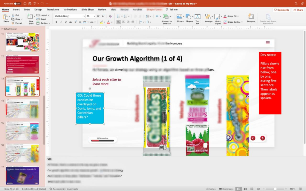
So what were some approaches I used for these? The owner of the contracting firm was very involved in this project, and I thought she had a pretty solid grasp on how much text goes on a slide/scene. There is a time and place for paragraphs in Storyline, I suppose, but I appreciated her tendency to encourage keywords with voiceovers, instead of a word-for-word reading of a chunk of text on the screen. In the above image for “Our Growth Algorithm (1 of 4),” you can see that there’s much more voiceover than text on the screen. But the message is clear that these three items are of importance. And you can see on the left that the following 3 slides also have minimal text, but the voiceovers explain the topic.
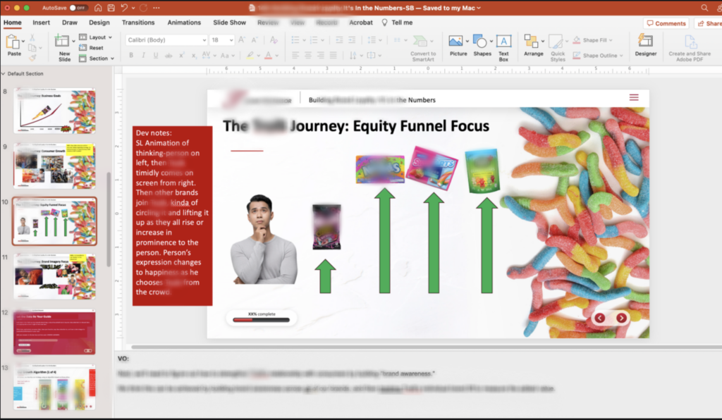
On this slide, it was going to be a simple Storyline animation with a voiceover explaining the process. While these images aren’t the finished, graphically designed product, we still would go for minimal busyness on the screen. I should also note that this training contains captions, so while the spoken text isn’t in the scene, it will appear if the user turns on captions.
Another thing I had to keep in mind was what content constituted which interaction. In many instances, my team designed the training so that users learned concepts or info by doing; learning by failing or getting something wrong. Discovery. These took the forms of drag and drops or MCQs.
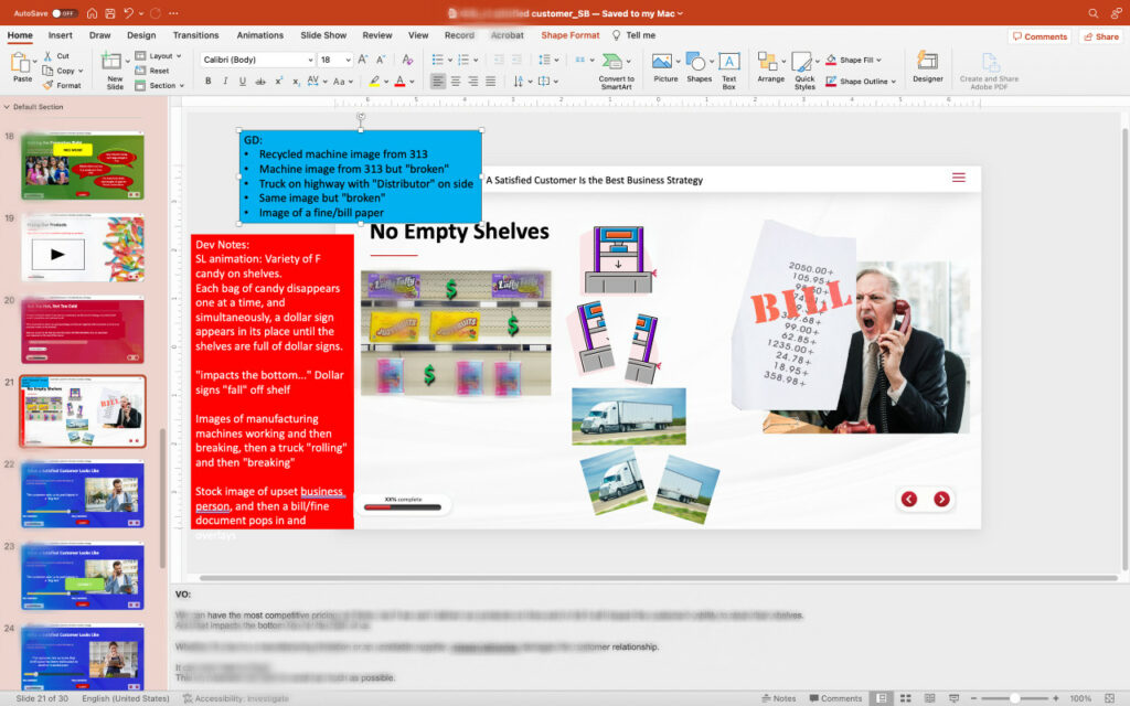
Other means we used were animations….or “animations.” We had extensive discussions about what animations were and how they would be built. These types of explanatory features require intense dev work — that is, time and money. The point is that we had to decide if something like the above slide “No Empty Shelves,” showing the supply chain and how it can break down, was going to be a Storyline “animation” (image paths and transitions and layers and states…) or an externally built animation (Vyond, After Effects, Adobe Animate, etc…).
We also had what most people would call reflections. It was a time to synthesize the presented information and insert oneself into the picture.
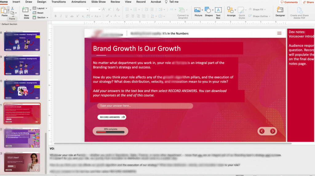
So here, we’re asking the learner to think about where they fit in the company’s plans for growth, and then to apply these three facets of growth to their own role, if possible. Some of these reflections had immediate feedback after the learner pressed “Record Answers” so that they knew their ideas were on the right track. But other reflections were more personal and did not need feedback.
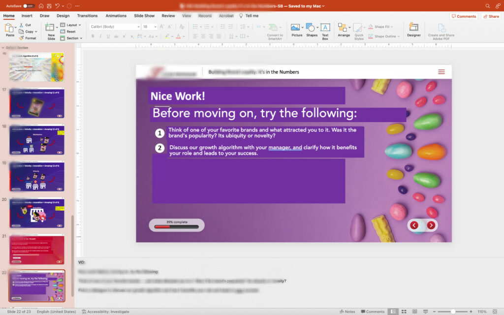
The second to last slide was a “go do” slide. We had a number of discussions about the final two slides, partly because the client half-way through the project wanted accountability for the learner and their managers, and also because we needed to ensure standardization. Most of mine consisted of first a “Think about…” to, again, bring the learner into the picture, as either an employee or a consumer of the product. Then the second one tasked them to talking to someone — a manager or colleague — about the topic of the episode and how it affects their role.
Some takeaways from this project:
- Less is more – I appreciated the idea of letting the voiceover do a lot of the heavy lifting and accentuating the points on the screen.
- Cross-functional teamwork is critical – There were a lot of moving parts and humans involved, so having processes and check-points was helpful to make sure the workflow flowed. Detailed instructions for the developer really greases the workflow wheel.
- SME Walk-thus – I was tasked with recording 6-8 min storyboard walk-thru videos to make sure the reviewers understood the feedback process and what the different components did. Yes, we had dev notes that explained how things moved around on the screen, but can’t simply hope the SME gets it. I think it’s a nice customer service touch, but probably not feasible for every project.
- Specificity – As you can see, I make very detailed storyboards. This can scare clients because they can’t help but think, even if you tell them, that this is EXACTLY what the training will look like. It’s a delicate balance making sure your dev team has a solid grasp on what you want vs. easing the client’s mind about what they’re paying for.
